Welcome to
Aircall's brand platform
Everything you need to represent Aircall: logo files, colours, typography and the way we speak. Take what you need, keep it as it is.
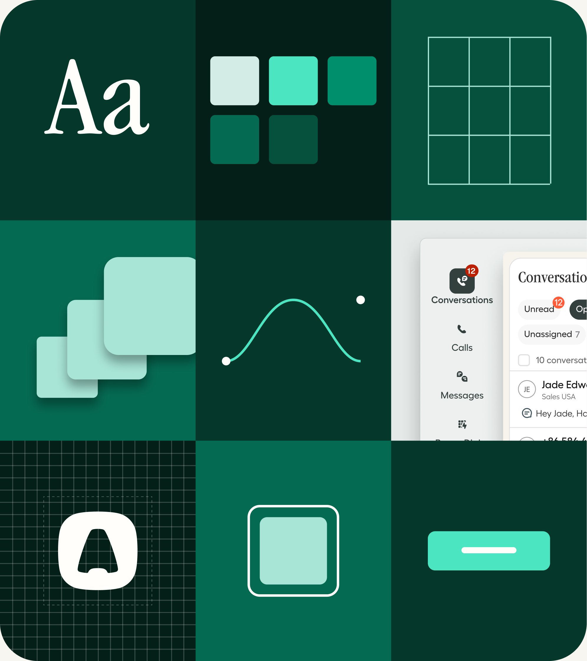
Our belief
Every conversation deserves context
Aircall is the customer communications platform that gives sales and support teams the full picture of who is calling and why. More than 23,000 companies rely on it to have better conversations, and to turn them into lasting relationships.
01 / Foundations
Foundations
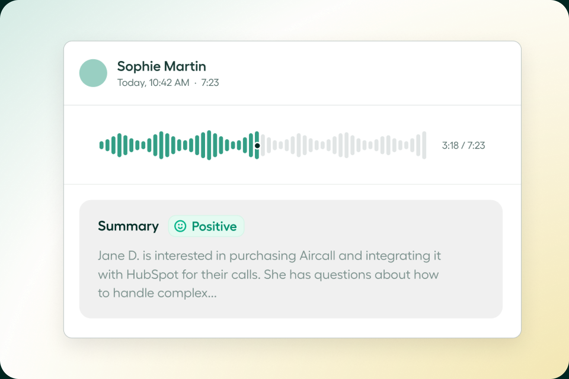
Everything starts here. The brand book gathers the positioning, the visual system and the tone in one place, so every team tells the same story.
Read it before you design, write or present anything with the Aircall name on it.
02 / Logo
Logo
Three lockups, five colours, one rule: use the files as provided. The aircall.ai lockup leads, the wordmark follows, the icon covers the smallest sizes.
Three lockups
The aircall.ai lockup is the primary mark. The wordmark is for contexts where the domain is already clear. The icon stands alone under 24 px or as an avatar.


Five colours
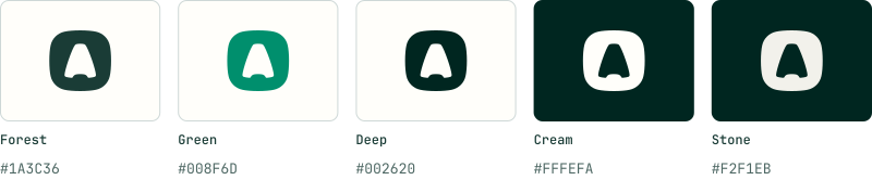
Forest, green and deep sit on light backgrounds. Cream and stone sit on dark ones. Nothing else, and never two variants in the same composition.
Clearspace and minimum size
Clearspace
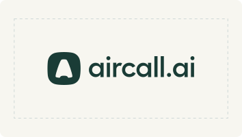
Keep one icon height clear on every side. Nothing enters that zone: no text, no other logo, no edge of the frame.
Minimum size
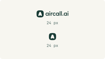
24 px on screen, 8 mm in print. Below that, use the icon alone.
24 px
Do and don't
Use the SVG or PNG files as provided
Pick one of the five colours and keep it
Keep the proportions when you scale
Recolour, add shadows, outlines or gradients
Stretch, rotate, or crop the mark
Put a light variant on a light background, or dark on dark
03 / Colors
Colors
A cream canvas, one brand green, a deep forest for text, and five accents that stay decorative. Warm, calm, readable.
Paper
The canvas. Cream first, then two quieter papers for alternate sections and cards. Pure white is reserved for product UI.

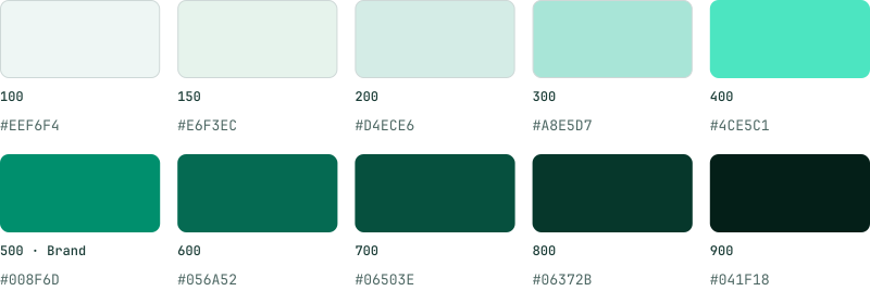
Green
Green 500 is the brand green. It carries buttons, links and the logo, never body text. When a solid green needs text on it, use 600 and pair it with cream.
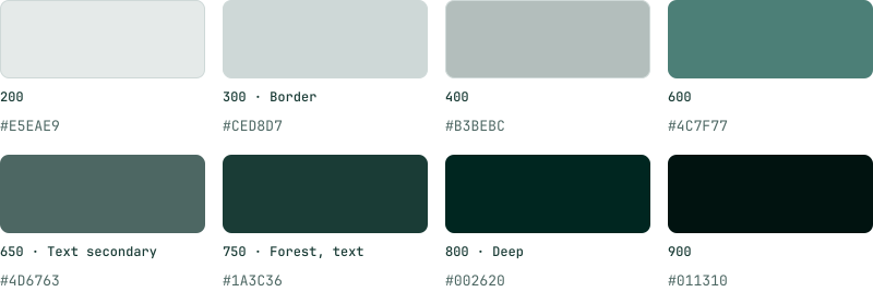
Forest and neutrals
Text lives in forest, not black. Neutral 750 is the primary text colour, 650 the secondary, 300 the border, and 800 the deep ink behind dark surfaces.
Accents
Five accents for charts, tags and illustration. They are decorative: an accent never carries meaning on its own and never carries body text.

Gradients and washes
Two gradient surfaces and three soft washes. City Nights is the dark surface for heroes and CTA blocks, always with cream text. Dawn is the light surface for feature blocks. Washes sit behind product visuals. No gradient ever goes directly behind body text.

04 / Typography
Typography
Three typefaces, one role each. A serif for brand moments, a sans for everything read at length, and a mono for labels and actions.
The three typefaces
ITC Garamond Narrow
Headlines and brand moments, Display through H3. One weight, 400. Never used for long copy.
Answer every call with context
Display 91 · H1 61 · H2 40 · H3 27
Fellix
Subheads and body copy, H4 through the smallest paragraph. Weights step 600, 500, 400. Hierarchy comes from size, not from a bolder weight.
Answer every call with context. Aircall gives sales and support teams the full picture of who is calling and why.
H4 18 SemiBold · H5 16 Medium · Body LG 20 · Body 16 · Body MD 14 · Body SM 12
JetBrains Mono
Buttons, captions, labels, overlines and navigation. Uppercase and short: a mono line signals an action or a label, never a paragraph.
Answer every call with context
Caption 16 · Buttons 12 · Overline 12 · Label 12
In practice
Sentence case everywhere. Headlines and buttons take no final period.
The serif is for headlines only. Anything read at length is set in Fellix.
Emphasis comes from size and hierarchy, never from a bolder weight or italics.
Keep body lines between 60 and 75 characters. Long copy gets a narrower column, not a smaller size.
Small text is never set in brand green. Green is for buttons, links and the logo.
05 / Voice
Voice
How Aircall sounds. Confident, grounded, specific, and always on the customer's side.
Four pillars
Confident, not arrogant
We know what we do well and we say it plainly, without talking down to anyone.
Grounded, not buzzword driven
Real outcomes over hype. If a word does not mean something concrete, we cut it.
Specific, not generic
Numbers, names and situations. 23,000+ companies, not “thousands of customers”.
Empowering, not surveilling
We help teams coach and see clearly. We never describe watching people.
Words we use
A few swaps that keep the story consistent across sales, marketing and product.
House style
Sentence case
Headlines, buttons and navigation are all sentence case. No final period on a headline or a button.
Contractions welcome
We write the way we talk: we're, it's, you'll. Serial comma in lists.
Buttons start with a verb
Book a demo. Start a free trial. Download the files. The action comes first.